Interacting with the data in OpenSpending
Raw fiscal data gets boring fast. That is why visualisation is such an important part of OpenSpending. When you explore the database, you'll eventually stumble on a data package of interest to you. Clicking through to look at this data package in detail, you'll get to an app that we call the "Viewer". It presents a number of ways to interact with the data in the package, via easy-to-use charts and tables.
Walkthroughs
-
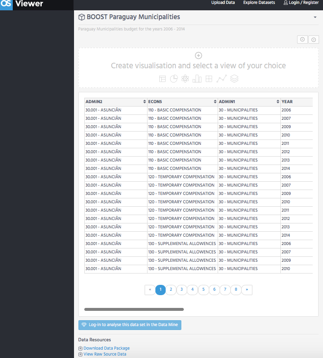
Now that you have opened your data package in OS Viewer, you can interact with the tool to a. explore your data; b. apply filters; c. create a desired visualization; d. download the data package or View Raw Source Data; or e. Analyze the data set in the Data Mine.
-
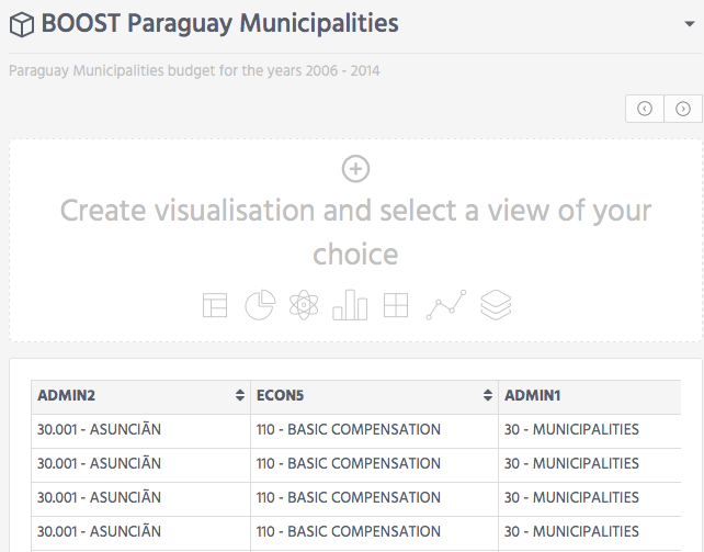
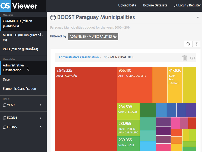
At first, you see the visualizations menu and a table preview of the data.
-
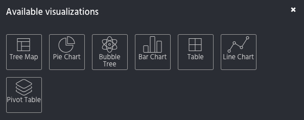
Click on the “Create visualisation and select a view of your choice” to select from five visualization types (Tree Map, Pie Chart, Bubble Tree, Bar Chart or Line Chart), a table or a pivot table.
-
On the left side of the screen, you will see a menu with “Measures,” “Hierarchies,” and “Filters.” Apply these dimensions to select data for your visualization.
-
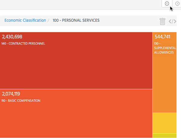
You can click on the visualization area to navigate through the hierarchies/levels.
-
Or click the buttons above the visualization (upper right side).
-
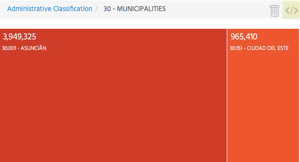
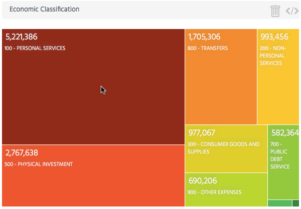
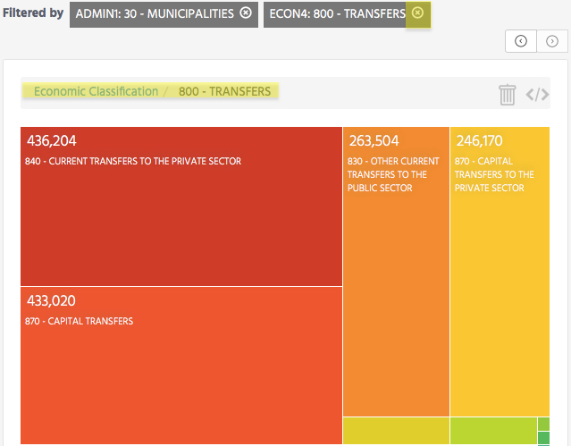
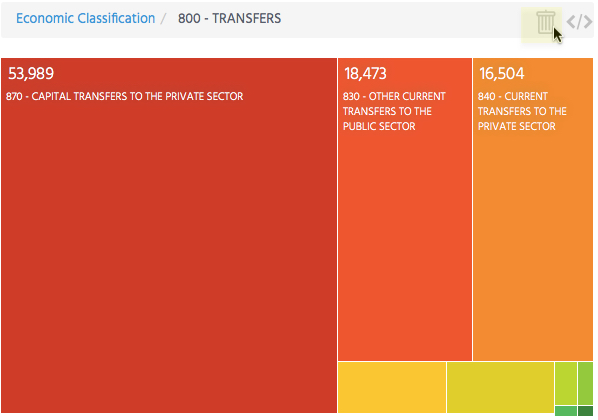
You can also click on the breadcrumbs (see image below “Economic Classification/800 - TRANSFERS) describing your position in the visualization, or remove a level by clicking the boxes next to “Filtered by.”
-
If you want to delete the current visualization and create another, there is the option to remove it.
-
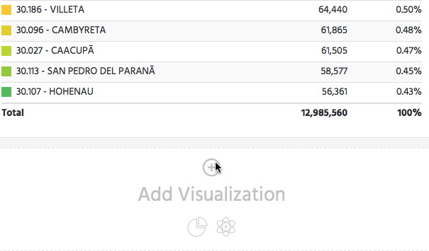
After you create the first visualization, below there is the option to add another.
-
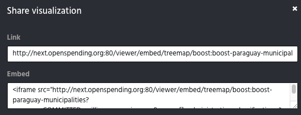
Use the Share visualization button at the upper-right corner to get the visualization link and embed code.